The graduate diffusion visualization shows where nurses are practicing two years after graduating from a nursing education program. Read below to find out more about how to use the visualization.
- Select a program.
- Understand the map.
- Add multiple programs.
- Get more data in the program table.
- Download data.
- Remove programs from map.
Select a program.
To start, select a program type and an educational institution, and then scroll down to view the map.
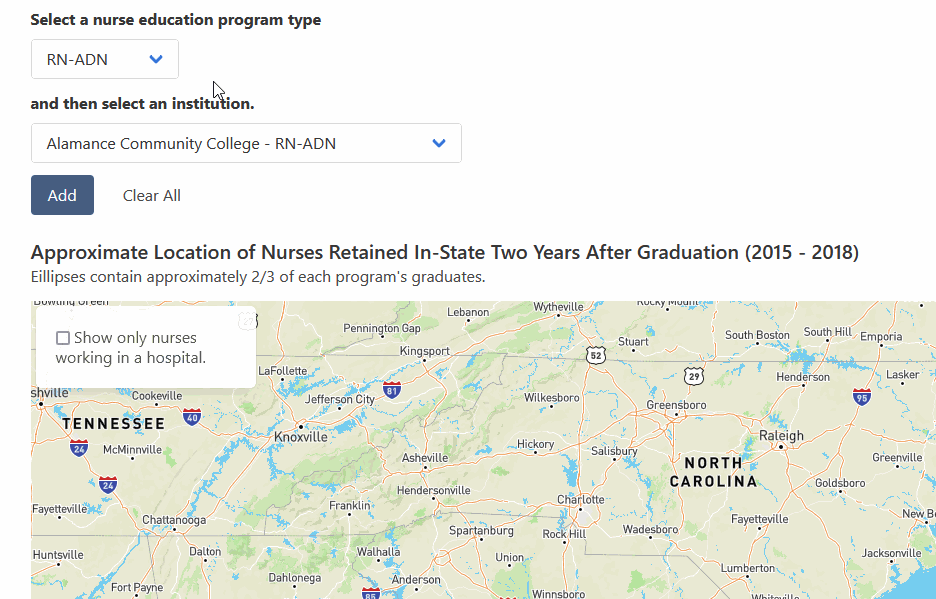
Understand the map.
In the map, you can see dots representing the approximate work locations of nurses two years after graduating from the selected nursing program. (In this case, Forsyth Tech’s LPN program.) The ellipses encompass 2/3 of a program’s graduates, providing a more holistic view of a program’s footprint.

To the right, you can access the map controls for zooming in and out. The the left, you can check a box that limits the displayed dots to only include nurses working in a hospital setting.
Add multiple programs.
You can add another program to the map.

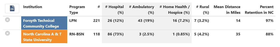
Get more data in the program table.
Below the map, is a table with additional data about the programs, like the number of nurses who are working in certain settings or who are in a rural county. The table also displays the percentage of graduates who stayed in state. These data are from NC Tower.
Download data.

Remove programs from map.
You can remove programs from the map by clicking on the X’s.
